An earlier article on this blog talked about physician rankings. In this post let’s look at hospital rankings.
America’s best hospitals
There are various agencies and organizations that rank, index and grade american hospitals. Some of the well know ones are US News, Thomson Healthcare (top 100) and more recenlty web 2.0 sites like HealthGrades. The idea behind these rankings is to provide consumers a guide map to choosing hospitals.
Methodology
Methodology that these publications and agencies use range from internally developed surveys to benchmarking databases and others use information that is collected and published by United States Department of Health and Human Services. US news ranks by specialty as their goal is to identify facilities that excel at treating variety of illnesses within a specialty, as opposed to just few procedures. US News uses data from the American Hospital Association survey of its members.
Web 2.0 application – Finding a hospital near you
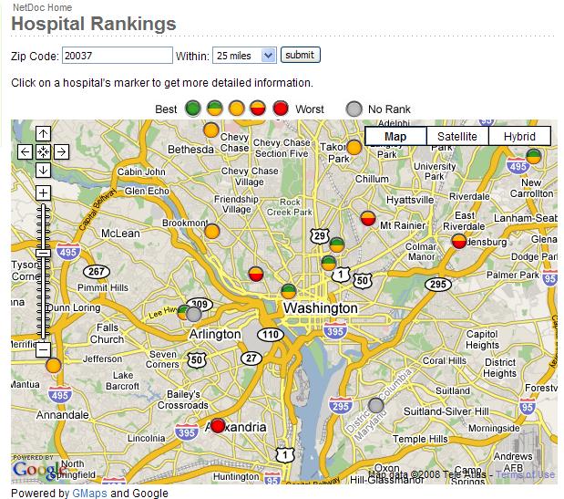
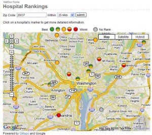
Recently we came across a web based application that lets you search for hospitals in your neighborhood (by zip code) and tells you how good the hospitals perform on a variety of process measures that the hospital compare database (Department of Health and Human services)tracks. The best hospitals have green stop lights and the worst has red. We tried this on Washington DC area hospitals and here is what we came up with. Check it out for yourself.
Air traffic control
There are many areas in a hospital that need dashboards to be able to identify and resolve problems. Let us look at an example. In many ways, a bed management or bed control function in the hospital is like an Air Traffic Control. They they control the take off (discharges) and landings (admissions). In hospital terms they control the patient flow from several areas such as emergency and surgery to Inpatient units. But, there is one major difference between an air traffic controller and a hospital bed manager. While the former has ‘real time’ information and visual indicators to make decisions, the latter relies on numerous phone calls,faxes and experience to make their bed decisions. Naturally, the decisions are delayed or sub optimized (like when patients are shifted to a higher level of care even when there is not need for it). The result is bottlenecks and delays throughout the system. Which in turn increases ‘patient days’ and negatively impacts clinical and financial outcomes.
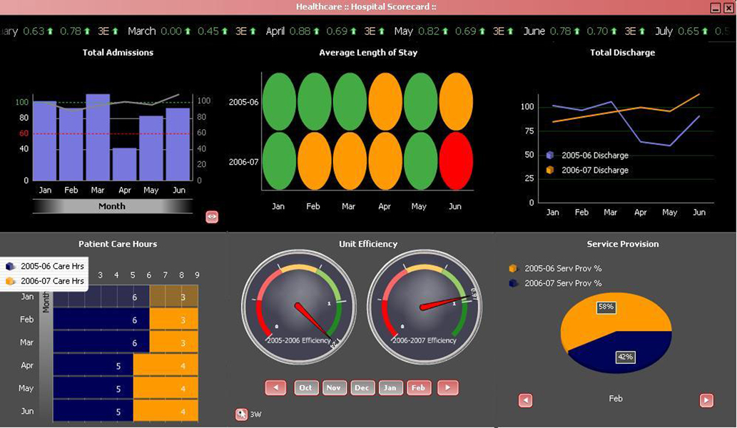
Visual view of data
Hospitals in the US, tend to collect terrabytes of data annually. But the data is not useful in and of itself. Because, it remains inactionable unless its visually processed and represented in the form of a meaningful dasboard with bells and whistles built in. Reverting back to our example, if we do not have a handle on our daily/hourly admissions, length of stay and patient care hours and other key performance indicators, it is virtually impossible to reduce delays and length of stay for patients.
So what should a hospital dashboard look like. We did some research and found a great example. One of the best designs we found from our research was iDashboards . So check it out below !!!

Empowering Healthcare Practice and Management